Services
Branding Illustration Print and Digital Social Content Design
Client
York Pride
Year
2025
Project Information
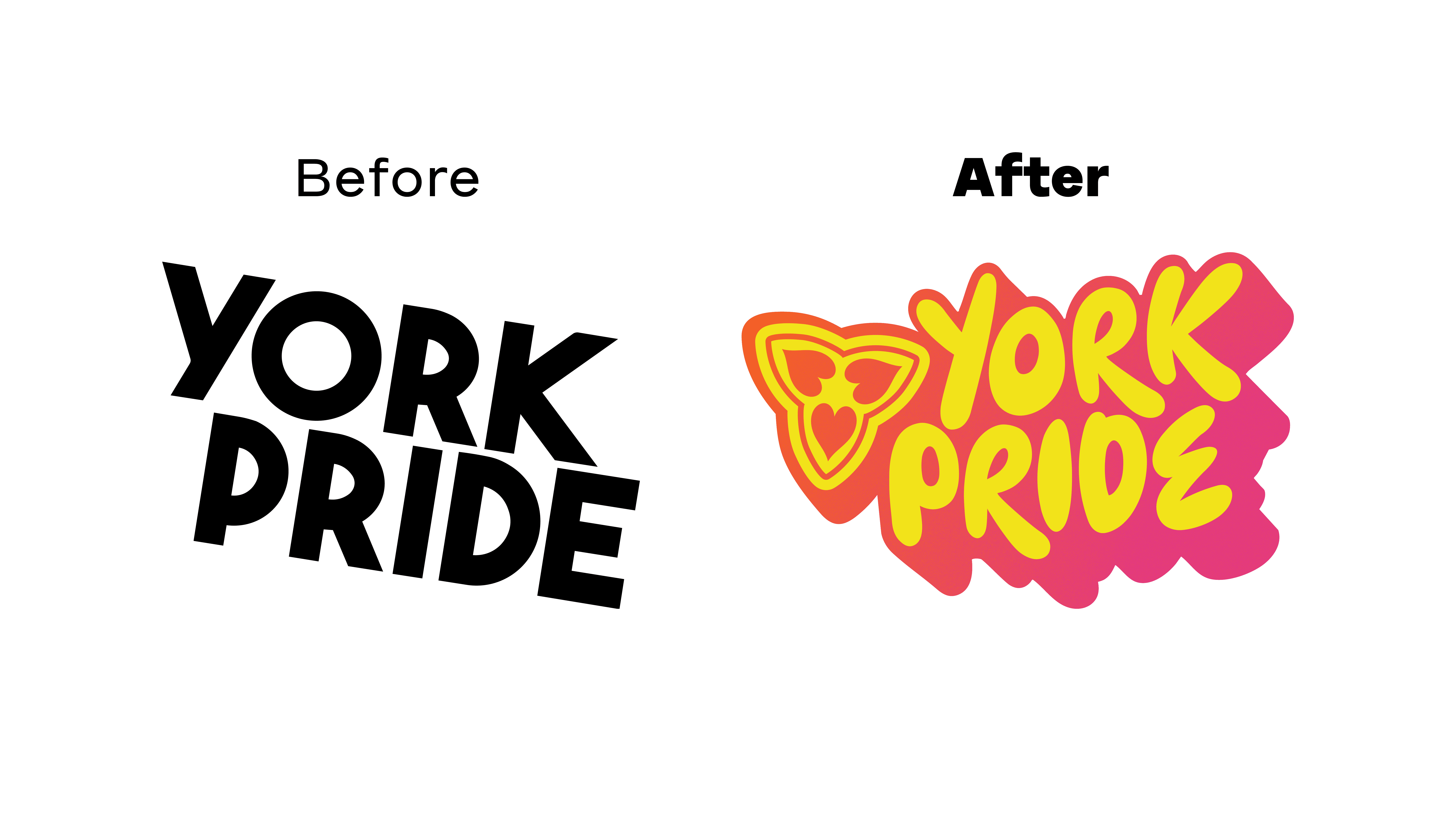
York Pride, one of the largest 2SLGBTQ+ organization in Ontario, had celebrated their remarkable achievement of 25 years in operation. To mark this milestone, they wanted to refresh their brand and give it a new, vibrant look. They had sought a more fun and playful vibe for this transformation.
York Pride’s branding in previous years lacked approachability, inclusivity, and a family-friendly vibe. These elements weren’t strong enough to truly celebrate the 25th anniversary in York Region.
To create a fresh experience for the community, I introduced new branding guidelines, a colour scheme, logos, a social media campaign, and both print and digital design materials. These changes align with the team’s new vision and commemorate the 25th anniversary of their regional presence.
The design included elements of York Region’s current municipal logo, but with a unique twist that symbolized the organizations vision, through respect, education and authentic connection. The three hearts forming the leaves in the “trillium” represents these three unique pillars York Pride upholds. Additionally, the font chosen added a quirky and fun touch to the overall identity.